catalogtree 4.0


Source: http://www.catalogtree.net.catalogtree. License: All Rights Reserved.
On the homepage of their portfolio website, Arnhem-based design studio Catalogtree present their body of work in an extensive alphabetically ordered text list. Hovering over an entry reveals corresponding items, connections are visualized by color.
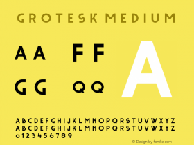
The eye-catcher in the otherwise monotonous design is the logo on the top. The two letters are from one of the simplified blackletter designs that emerged in 1930s Germany. Tannenberg (D. Stempel, 1934) looks like a good match. Due to their popularity in the first years of the Third Reich, these Schaftstiefelgrotesks ("jackboot grotesques") are now charged with negative connotations, and are hardly ever used. In the context here – two single lowercase letters on a contemporary Dutch design site in English language – this sad historic burden is nonexistent. All there is are fascinating bold shapes, kinked and sheared at interesting angles.

Source: http://www.catalogtree.net.catalogtree. License: All Rights Reserved.






 闽公网安备35010202000240号