


Italian Vanity Fair (Feb–Mar 2013)


Source: http://devinpedzwater.wordpress.com.License: All Rights Reserved.
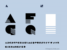
H&FJ DidotandVF Sans. The latter was designed in the late '90s by James Montalbano for Vanity Fair. The US version of the magazine doesn't use the typeface much anymore, but Pedzwater employs it nicely here in Italy.
With 32 styles that maintain their characteristic pointed apexes ('A', 'M', 'V', 'W') all the way to the boldest weight, VF Sans is an underappreciated Futura alternative. It has been compared to Vogue, a 1930s Intertype face create for Vogue magazine that is not available in a proper digital edition. Montalbano sees the connection, but it wasn't his intention to do a Vogue revival.

Source: http://devinpedzwater.wordpress.com.License: All Rights Reserved.

Source: http://devinpedzwater.wordpress.com.License: All Rights Reserved.

Source: http://devinpedzwater.wordpress.com.License: All Rights Reserved.

Source: http://devinpedzwater.wordpress.com.License: All Rights Reserved.


 闽公网安备35010202000240号