


Aeon magazine


Source: http://www.aeonmagazine.com.License: All Rights Reserved.
Aeon is a new UK-based digital magazine that launched in September 2012. The team commission long-form writing about ideas and culture, with an original essay appearing every weekday. The site is rapidly building up an archive of strong writing.
magculture.com
Aeon's tag line is "read deeper". For my taste, they could have digged a little deeper in their typeface choices. All the webfonts in use are freebies from Google's repository. WhilePT Serifcertainly is a sound choice, I could imagine more apt options both for the accompanying grotesque as well as for the drop caps on article pages. At the moment, they feel like placeholders, waiting to be replaced with the real thing at some point. In some places including the About page, the application is sloppy, too:Chivotakes turns withHelvetica. Elsewhere,Georgiasuddenly rears its all-too-familiar head.
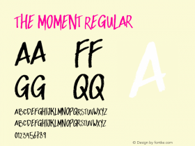
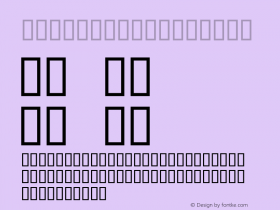
Last but not least, several text bits are rendered as pixel images. Since they appear alongside live text, this quickly shows and looks botched, especially on hi-res devices. The reason for that is to be sought in the fact that the specified typeface –Knockout– is not available as webfonts yet. I hope Aeon will incorporate them as soon as Hoefler & Frere-Jones has finished working on them.

Source: http://www.aeonmagazine.com.License: All Rights Reserved.

Source: http://www.aeonmagazine.com.License: All Rights Reserved.

Source: http://www.aeonmagazine.com.License: All Rights Reserved.


 闽公网安备35010202000240号