The Great Gatsby (2013) Film Promotion


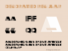
The high-contrast lettershapes in this old Atlas and Atlas Solid(Harold Lohner's updated and refined versions of his older freebie release), added a dimensional effect, and put a thick layer of shiny chrome on top of it. Together with the kaleidoscopic pattern, they thus successfully established a glittering Roaring Twenties atmosphere, the period in which the story of F. Scott Fitzgerald's novel is set in. (It goes without saying that it's the showy Hollywood definition of this already swank decade.)
K.H. Schaefer's Fatima Versalien AKA Atlas, as published by the Fonderie Typographique Française in 1933. Image courtesy of the Atlas by Commercial Type.
The history of this Atlas goes back all the way to 1933 (eight years after the publication of The Great Gatsby), when it was designed by K.H. Schaefer for the German type foundry Schriftguß AG vorm. Brüder Butter as Fatima Versalien. In the same year, Fonderie Typographique Française published their version of Fatima Versalien under the name Atlas (and marketed it as a decorated complement to their simpler Art Deco sans-serif Apollo). Schriftguß later added a related oblique typeface, Ondina (Karl Kranke, 1935).

From Tobey Maguire (Nick Carraway) …

… and Joel Edgerton (Tom Buchanan) …

… to Elizabeth Debicki (Jordan Baker), …

… Isla Fisher (Myrtle Wilson), …

… Carey Mulligan (Daisy Buchanan) …

… and Leonardo DiCaprio (Jay Gatsby) – The Great Gatsby stars quite a few big names.
In 2001, Harold Lohner digitized the 6-line typeface, added a Solid style and made the fonts freely available. On the FontBros site, Lohner writes:
Atlas is based on a classic analog Art Deco font of the same name. My first version of it – the one with stripes – was originally named Farouk, but I've changed it to conform with period sources I have since found. I've also recreated the companion Solid font; both are completely redrawn with very clean edges.
Both the free and the optimized commercial version keep it true to the source and feature a very narrow 'G' and a rather wide 'K' and 'M'. These glyphs – and maybe others – have been modified and normalized for this use, at least in some instances. Also has the number of lines been reduced to four.


In the trailer, the striped and the solid styles of Atlas are taking turns on a per-character base, and thereby intensify the metallic feel.
The Newport Classic SGas a webfont for navigation (though a web license doesn't seem to be available), and the slightly clumsyGovernorfor the Mostra Nuova would be better for both of these uses.





 闽公网安备35010202000240号