


Tage der Typografie – form+inhalt, Lage-Hörste (D), 28–30 June 2013


Source: http://www.tage-der-typografie.de.License: All Rights Reserved.
Posted as part of a little survey about websites for conferences on typography and graphic design – how do these specialist events present themselves typographically, in 2013?
Tage der Typografie ("Typography Days") is a rather small – but well-established and, from what I've heard, intense – event in Western Germany, hosted by a trade union's educational institute.
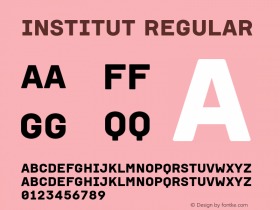
The website communicates: "We don't have too much time and money at our hands, and we rather spend it on the program itself than on a fancy web design." Although customized, the WordPress template with the time-tested Georgia and Verdana is very familiar. It works okay, but it doesn't wow anyone anymore. The type sizes feel smaller than they used to do a couple of years ago. The graphics for the 2013 event seem to use some Brandon Grotesque, but you can't see much of it on the website yet. The logo that accentuates the "white" parts of the letters reminds me of the recently released Modular Sans type system by Letterwerk – but it seems to be based on Futura.
Tage der Typografie is a good example for the pros and cons of off-the-shelf solutions. It makes you think about templates, especially since this year's theme is the relationship of form and content.
Webfonts: ✗
Designer credits: ✗
Typeface credits: ✗

Source: http://www.tage-der-typografie.de.License: All Rights Reserved.

Source: http://www.tage-der-typografie.de.License: All Rights Reserved.


 闽公网安备35010202000240号