


The Pie Hole from Pushing Daisies


License: All Rights Reserved.
Pushing Daisies was a delightful TV series that ran for two seasons on ABC from 2007–09. As is often the case with critically acclaimed television on broadcast networks in the US, the show was canceled before it could pull in a broad audience.
"The Pie Hole" is the diner in which much of the show takes place. While Pushing Daisies was praised for the quality and extravagence of its (artificial) visual effects produced by William Powloski, that neon sign up there is physically real.
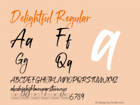
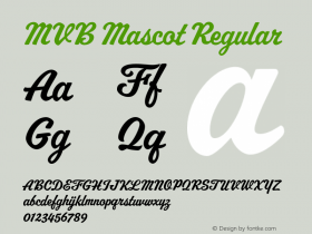
The letters come fromFreehand 521, Bitstream's digitization of Mandate, a typeface released by Ludlow in 1934. For the sign, the production designers extended the 'e's from the stubby forms that are leftover from a limitation of the metal type (which has connecting strokes on both sides of each letter). One would think the digital version could have corrected these shortcomings, but despite the typeface's popularity, Freehand 521 is not one of Bitstream's more considered efforts. Mandate has charm, but if someone was to open a pastry pit inspired by the Pie Hole, there are other legible retro scripts I could recommend, including: MVB Mascot, Metroscript, and House Script.
The imaginative over-the-top production design for Pushing Daisies was created by Michael Wylie. Here's a nice interview with him.

License: All Rights Reserved.

Source: http://boards.straightdope.com.License: All Rights Reserved.

Source: http://www.pushing-pixels.org.License: All Rights Reserved.

Source: http://bubblefrog.canalblog.com.License: All Rights Reserved.


 闽公网安备35010202000240号