New Erik Spiekermann Typeface Axel Premieres At TYPO Berlin 2009

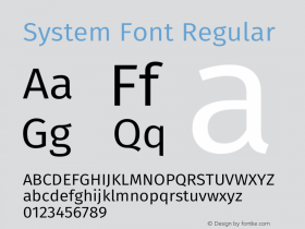
This 14th edition of TYPO Berlin was a special one for organizer FontShop Germany. The computers at the FontShop booth in the entrance hall of HDKW introduced their completely overhauled website to the German audience. But that wasn't the only premiere at the conference. Just in time for the re-launch of its website, FontShop also released a brand new typeface by Erik Spiekermann: Axel, an economical, highly legible font family optimized for on-screen use in office apps such as Microsoft Excel.

A TYPO visitor exlores the new FontShop Germany website against a backdrop with Axel.
Graphic and type designer, and FontFeed founding father Professor Dr. Erik Spiekermann is — amongst others — internationally recognized for his information design work. So it comes as little surprise that he would create Axel, a family of technically clever fonts specifically designed for use in constricted spaces (tables, columns, …). Why a special font for spreadsheets? Surveys have shown that multi-functional applications, such as Excel, are used for many more types of projects than just budgeting and bookkeeping. Users input words instead of numbers in over 90% of the cells. And the columns are usually too narrow for those words. Widely-used system fonts like Arial, Verdana and the likes either take up too much space or they are hard to read (i.e. Arial Narrow). With Axel, FontShop has created a typeface that is narrow without looking "condensed".

Erik Spiekermann says about his latest oeuvre — which he developed together with Erik van Blokland and Ralph du Carrois —
I was fulfilling my own needs: a simple, legible and economical system font, which looks particularly good on the monitor. We work with tables much more on the monitor than on paper.
What is special about Axel is less its aesthetic refinement for the reader than its usefulness to people who work at monitors every day.
Similar letters and numbers are clearly distinguishable (l, i, I, 1, 7; 0, O; e, c …).Increased contrast between regular and bold.Style set linking for Office applications (bold key).Small caps instead of italics for emphasis.High legibility on the monitor via "ClearType" support.Good complement of numbers (superscript, subscript, fractions…).Real WYSIWYG in Microsoft Excel.Pleasing look on paper.

Excellent legibility on the monitor: comparison of Axel with widely-used system fonts at 10pt in Excel in Windows.

A clear, economical typeface when printed, Axel uses up to 30% less space compared to widely-used system fonts (reduced image).
Try Axel out for yourself:
If you think only businesses and agencies can afford Axel, think again. FontShop Germany decided to use Axel to launch their new website, offering Axel for download at the introductory price of only €9.90 ($/€19.90 outside Germany) for the set (four styles, licensed for 1 to 5 users) until June 30, 2009. Erik Spiekermann is very happy about this special price:
I never thought there could be a font in that kind of quality for the same price as a music album.
How is such a steep discount possible for a quality commercial typeface? Because FontShop AG is the publisher, and wanted to release a font family for a price that renders illegal copying pointless. And because FontShop wants to give as many users as possible the opportunity to apply this new typeface in their work. It certainly doesn't herald an industry-wide price drop, nor is it a criticism towards our partners. On the contrary — after the initial launch period the family will cost € 79.90 (both prices exclusive of VAT). So don't waste any time and get Axel while it's still so cheap.
* ClearType is a technology introduced by Microsoft for rendering fonts on LCD monitors, and increases visible resolution by selective control of the RGB pixels with subpixels.
Header Image:Erik Spiekermann at TYPO Berlin 2008 © Gerhard Kassner






 闽公网安备35010202000240号