


Interview: Craig Ward talks graphic design lies and why you should stop hating Comic Sans

UPDATE 11/9/13: Due to its success, Popular Lies About Graphic Design has now been published it second edition – and is soon to be translated into Chinese.
UPDATE 3/12/12: Actar now says that orders have not been cancelled, but have been delayed by 10 days.
UPDATE 30/11/12: Due to a publishing snafu, all European orders for the book through Amazon have been cancelled (including from Amazon UK). If you want to get your hands on the book, visit the Actar website and order it there.
Craig Ward is a liar. The designer and art director has just released a book called Popular Lies About Graphic Design, where he sets out to demolish widely held 'truths' that he thinks are a lot of codswallop – from 'Graphic design is easy' (yep, Ed) and 'There's no budget but it's a great opportunity' (definitely) to 'The client is a $%&*' (not always) and 'Comic Sans is the worst typeface ever created' (erm...).
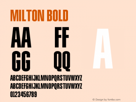
Each 'lie' is either demolished piece by piece, or used as a jumping off point to discuss what Craig's learned over his years in the business from starting out in London to his current career in New York. Funny answers are juxtaposed again thoughtful reflection – and the centre of the book is given over to the likes of Stefan Sagmeister, David Carson and Milton Glaser explaining the worst lie they've ever been told.
I sat down with Craig to find out more about the book, and explore some of the areas he touches on.
NB: Why did you use the concept of lies to set out these thoughts? For example, were these things you used to believe but experience has taught you differently?
CW:"I think the joy of being a designer is that it's a constantly evolving experience, there are surely parts of this book that my opinion will perhaps have shifted on in a few years time but that's kind of the point. I set out on page one (sort of) that fact that this is a book full of opinions. There are so many books out there that just say 'this is how it is supposed to be' that they don't really leave any room for interpretation and I certainly didn't want this to come across like that.
"Lies is a good hook, I think – it's punchy and memorable.
"The whole idea of the truth is subjective anyway, so it felt like a good format to set the lie out, distress it or warp it in some way typographically – and then argue why I believe this not to be the case."
NB: Who did you have in mind as a reader when you were writing this?
CW:"Myself and younger practitioners – students and recent graduates – are the main market really. I wrote these little essays for myself, way before I'd thought about collecting them into a book so there's an element of catharsis in there.
"I feel like I never got out of the student mentality – the experimental, try anything once kind of mindset – and I think that's something I'm really proud of. It's what (I hope) keeps my work fresh. There is, probably, nothing in the book that someone who has been working for 15 years won't have heard before – but hopefully they'll find something interesting the way it's written, the way I argue it and also seeing it in the context of the book.
"I actually love the idea of this little book living in designers' bathrooms all over the world; the kind of thing that anyone of any experience can dip in and out of."


NB: Is Comic Sans hated less for itself – even despite its ubiquity – but more as a symbol of the way that many people use fonts without any thought given to how they texture they text? And is this a form of snobbery in itself?
CW:"Definitely. As much as anyone likes to think that they're not a design snob, you're always judging other people's work – consciously or otherwise. Comic Sans has just had some really bad PR and that section represents kind of the fluffy side of the book which I wanted to put in there alongside some of the more worthy discussions."
NB: You argue that Helvetica isn't a "neutral" font and designers should ask themselves why they want such a font anyway. As more and more apps, sites and networks with a single typeface within them are being created that allow many forms of communication, do you think we need to use a greater choice of neutral typefaces for people to use within them? Faces that are as appropriate – or at least not inappropriate – to caption Chloe Sevigny Instagramming a cupcake as to say 'Call home. Something's happened to Dad.'
CW:"I think what we're seeing is another way in which the Internet has democratised and at the same time confused things.
"The breadth of content and opinions online means it's almost impossible to create a catch-all style for a website like Twitter, where you have people posting pictures of their lunch next to people announcing they've been diagnosed with cancer.
"The diversity on Twitter is actually astounding to me – there are whole sections of it that we never see. I sometimes click on those trending hashtags to see what they're about and the people responding to them are so far away from the kind of people I interact with day to day but, here we are, all using the same online space.
"Equally, sites like MySpace where people had more control over the look of their page (originally) probably failed (or were less successful in the long-term) because, you know what, I don't want to try and read about someone's life on top of a fucking floral background in yellow or pink text. People do make bad decisions visually when allowed to and so perhaps the neutrality that Facebook and Twitter offer are necessary."


NB: You say "stock photography has basically ruined the photography industry". Are 'crowdsourced' design services like 99designs and website template services from hosting firms doing the same to the design industry?
CW:"Without question. There will always be work for very good photographers and very good designers.
"But I honestly think stock images, elements, icons, templates, etc are like cigarettes; every time you use one you take five minutes off your career.
"Portfolio sites especially – like that Indexhibit thing. I mean seriously? You can't be bothered to design your own fucking website? What kind of message does that send to your clients? Template sites are something that should be used by people who don't know how to design and don't want to have to deal with finding a designer they like and who they can afford. They're the equivalent of Prontaprint or something.
NB: You might get 99 per cent of your approaches by email or phone, but you're an established name in the industry. Do newcomers still need to move to near a creative hub – if not London, then say Manchester, Leeds, Brighton, etc – for networking, seeing clients face to face or just to have a day job at an agency while they get themselves established?
CW:"I think it's different for everyone. My first commissions came in over email because I had taken the time to create a set of promotional postcards as mail-outs. This was long before I was anything in industry. I mailed them out to magazines I wanted to work at, followed up with a call or an email and then they eventually came back with work. I could've been based anywhere at that point.
"As it happens, I was in London at the time and I did have a day job – that I didn't enjoy. It was the lack of enjoyment I was having that gave me the impetus to start making noise about myself. I think it's important for everyone to find their own way through it though."

NB: Did you choose to phrase some of the 'lies' just to provoke a reaction? For example, you say 'people care about design' but then go on to explain that you mean aesthetic design rather than Donald Norman-esque design-as-usability.
CW:"The hardest thing about putting a book together, I found, was giving people reasons to keep turning the page and reigning myself in. My work and my working methods are different from project to project and I very rarely use the same technique twice. That's fine on one-off projects but, there has to be a uniformity to a book; a pace and a rhythm to stop it feeling disjointed.
"There was the matter of it being translated into different languages to bear in mind, so I had limit myself with regards to what I did to the chapter headers. The headlines, therefore, became important so, to an extent perhaps a couple of them are slightly more inflammatory than they could be but, with that said, I didn't make any of them up – they were all heard in conversation, in forums online and in articles I had read so, my conscience is clear."
NB: Will you work for us for free? It's a great opportunity?
CW:"Will you buy five thousand copies of the book? Then sure!"


 闽公网安备35010202000240号