Interactive FF Mark Specimen Minisite

I have worked in the type business for the past 23 years. Before that I witnessed the launch of pioneering type families like Avenir, Rotis, ITC Officina, … during my five years tenure as editor in chief for PAGE. To my knowledge, in all these years (and perhaps neither in the preceding decades) no other typeface enjoyed a similarly elaborate premiere as FontFont's new FF Mark. Sure, back in the days typefaces were launched with large receptions and press conferences in world cities like Paris, and even entire books or newspapers were printed and distributed for free to celebrate certain typeface releases. Yet what exact purpose did they serve? Until the early 1990s new type families were often developed simply to justify the investment in expensive machinery, to stir up competition, to copy competitors' successful designs, and sometimes to define a new aesthetic. This is why those prestigious launches were primarily aimed at investors and service providers. Then came the art directors, and last in line were the designers and typographers.
Hannes von Döhren and Erik Spiekermann at one of the final checks of the FF Mark proofs.
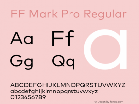
Since type has been liberated from specific technologies and machines thanks to desktop publishing, fonts are finally released to the market for their users. They want to know exactly what the new typeface is, what it looks like in all its minute details, and how it performs on screen. And if a new design builds on a specific tradition potential users will like to learn more about its historical background. Finally, they want to be enchanted by beautiful curves, surprising design details, an abundance of specimens, in-use samples and suggestions. All of this can be found in the FF Mark minisite and the 136-page PDF Info Guide (keep in mind that the smartphone version is not fully operational yet).
The website opens with an introductory video loop showing the development team at work on FF Mark. After this all twenty styles of the font family can be tested with the actual web fonts, with customisable text and individually adjustable font size, line spacing, alignment, and colour.
An interactive world clock allows the visitor to try out four of the nine available numeral sets of FF Mark, featuring botched spelling of the time zone cities – a nod to the Bauhaus tradition of writing.
All ten weights of FF Mark in sequence: type any character on your keyboard to see it (1) in different weights, or (2) to compare it with other weights, or (3) …
… to see all weights overlaid on top each other, as if viewed on a lightbox.
The layout box shows FF Mark in different sample applications, for example in a newspaper, on a book cover, on a tablet screen or computer monitor, …
mark_01
The minisite concludes with a detailed historical analysis of the roots of FF Mark, researched, compiled and written by the young historian Ferdinand Ulrich.





 闽公网安备35010202000240号