


Fenella illustrated children books by David Gentleman


Source: http://www.davidgentleman.com.David Gentleman. License: All Rights Reserved.
In 1966, David Gentleman designed a series of four illustrated children books about a little girl on holiday. In addition to Greece and Ireland, Fenella also travelled to Spain and the south of France. The books were released in 1967 by Jonathan Cape Ltd., London.
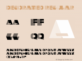
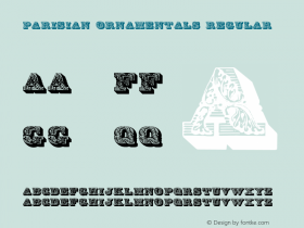
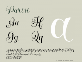
The type for the titles is a combination of two heavily decorated and shaded display typefaces. The first one is based on Poster Bodoni and has been revived digitally asBodoni Ornamentalby Michael Hagemann of Font Mesa. The second one goes back to a typeface from c. 1820 by the Paris-based foundry of Joseph Gillé. It was adopted by Deberny & Peignot, where it went under the name ofLettres Ombrées Ornées. Dieter Steffmann made a freely available (but unsatisfactory and limited) digitization of the same name in 2002. José Jiménez' commercial version, Parisian Ornamentals (2010), is even worse and maybe derived from the freebie. If you happen to know more about the origin of the historic typeface designs, I'd be grateful for any pointers. The italic fat face isThorowgood.

Source: http://www.davidgentleman.com.David Gentleman. License: All Rights Reserved.


 闽公网安备35010202000240号