


We Love Life by Pulp


Source: http://www.flickr.com.Image via Emmanuel Lodieu. License: All Rights Reserved.
For Pulp's final album in 2001, Peter Saville contrasted two very different typographic styles — intricate floral letters cut by hand into wood, and plastic label tape stamped by a machine.
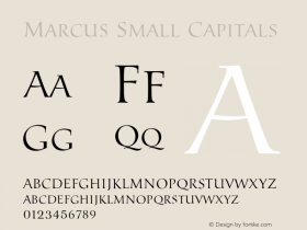
The large letters come from at least two designs (the 'P's are from different alphabets) in a decorative wood typeseriesby the Lettres Ombrées Ornées is a similar design but is based on a slab serif model and is much less varied in its ornamentation.
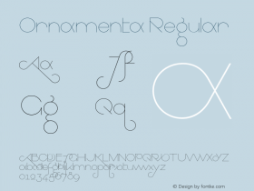
"We Love Life" is made not with a font, but with a labeler (such as aFF DynamoeandChromosome,
Printed credits:
Design: Howard Wakefield and Marcus Werner Hed
Art direction: Peter Saville and Jarvis Cocker

License: All Rights Reserved.

Source: http://www.flickr.com.Photo by Bas van Vuurde. License: All Rights Reserved.
According to PulpWiki, non-UK versions of the album have autumnal colors rather than green.

Source: http://rover.ebay.com.License: All Rights Reserved.
Australian promo poster using Chromosome.

Source: http://www.poprockposters.com.License: All Rights Reserved.
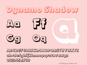
Promo poster using the FF Dynamoe font rather than physical label tape.

Source: http://rover.ebay.com.License: All Rights Reserved.
Swedish promo poster also using FF Dynamoe.


 闽公网安备35010202000240号