Volksbühne Berlin Flyers and Leaflets


Photo: Florian Hardwig. License: CC BY-NC-SA.
Posted as an addendum to my blog article about the Volksbühne poster campaign.
In the blog post, I wrote "Volksbühne is blackletter. Blackletter is Volksbühne." It should become clear what I meant by that when you take a look at the countless flyers for the events of the current season. LSD Design uses more than a dozen different blackletter typefaces, from all subcategories. They are claiming the whole genre for the Volksbühne identity – and it works, because hardly anyone else dares to use these typefaces.
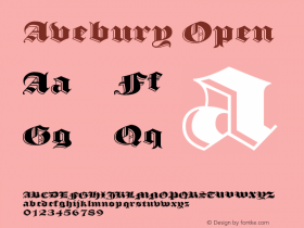
There is textura, fraktur, and one bastarda (Zeitungs-Schwabacher). Some are well-known, like Wilhelm Klingspor Gotisch, others relatively obscure, like Münchner Gotisch. Linotype Textur is not the only contemporary design: there is also Agincourt (David Quay, 1983) and Avebury (Jim Parkinson, 2005). One could think that each flyer got its own typeface, but that's not true. Some appear twice, like Haenel Fraktur, some even three times, like Deutsche Reichsschrift.
There are three exponents of the controversial simplified gotisch or "schaftstiefelgrotesk": Nürnberg (Ludwig Wagner, 1934), Tannenberg (D. Stempel AG, 1933–35) and National (Ludwig & Mayer, 1933–38). Unlike on the posters, Potsdam does not make an appearance here (yet). Tannenberg (Das Duell, Dancing About) is confusingly similar to National (Kill your Darlings!). Seeing all the elements of the eclectic visual identity in context, I must admit that, from a formal standpoint, it makes sense to include some simpler, unadorned typefaces – blackletter grotesks, so to say – in the mix.

Photo: Florian Hardwig. License: CC BY-NC-SA.
The backside of each sticker holds information about the event. This text is presented rather conventionally, in Akzidenz-Grotesk.

Photo: Florian Hardwig. License: CC BY-NC-SA.
The showcases on the outside of the Volksbühne building display the monthly program, unfolded. The actual agenda is not in blackletter, but in Akzidenz-Grotesk. The URL and the verso with the Warhol quote is in Deutsche Reichsschrift.

Photo: Florian Hardwig. License: CC BY-NC-SA.
The figures on the monthly program leaflets for August/September and October are from Tannenberg Schmalfett.

Photo: Florian Hardwig. License: CC BY-NC-SA.

Photo: Florian Hardwig. License: CC BY-NC-SA.
The assorted take-away flyers, as they are offered in the Volksbühne foyer.








 闽公网安备35010202000240号