


Wired, 2013


Source: http://typofonderie.com.Images via Typofonderie. License: All Rights Reserved.
Didones are usually associated with fashion magazines, so it is somewhat surprising to seeAmbroisereplace the rugged, mechanical type we're used to seeing in Wired. lifestyle, fashion, and women's sections of the newsstand. I wonder: Is Wired trying to broaden its readership? Does this represent an even more fundamental shift in the brand? Or is this simply a standard magazine refresh?
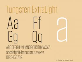
On the other hand, some treatments have a news mag vibe. And the combination of Ambroise with the machined squareness ofTungstenandFF Oxidedo keep things from getting too frilly for the subject matter. Perhaps the unexpected is exactly the right choice after all.

Source: http://typofonderie.com.Images via Typofonderie. License: All Rights Reserved.

Source: http://typofonderie.com.Images via Typofonderie. License: All Rights Reserved.
De Almeida doesn't skimp on typefaces. I count five in this column alone. Not sure what the bulbous thing is for "Mat Honan".

Source: http://typofonderie.com.Images via Typofonderie. License: All Rights Reserved.
The text face isExchange, originally designed for the Wall Street Journal by H&FJ and not part of their standard retail library.

Source: http://typofonderie.com.Images via Typofonderie. License: All Rights Reserved.

Source: http://typofonderie.com.Images via Typofonderie. License: All Rights Reserved.

Source: http://typofonderie.com.Images via Typofonderie. License: All Rights Reserved.

Source: http://typofonderie.com.Images via Typofonderie. License: All Rights Reserved.


 闽公网安备35010202000240号