


Extension 765: A Marketplace from Steven Soderbergh


Source: http://extension765.com.License: All Rights Reserved.
Steven Soderbergh's retail site and blog has a cinematic air. It's not a glamourous Hollywood look, but dark and raw, like film noir — a natural fit for the director's ouvre. The design, by online studio Launchjam, doesn't go overboard with the theming. The site is spare, with the feel achieved primarily through the type.
The main text is set in a typewriter font, emulating an old-school film script. The typeface, namedMENCKEN, appears to be a proprietary design by FF Trixie which offers a more realistic analog simulation), but I can understand why someone — especially an exacting director like Soderbergh — would want their own typeface that meets their own particular requirements for typewriter model and level of wear.
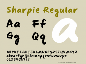
MENCKEN is paired with Joachim Müller-Lancé'sFloodwhich delivers short words like hand-scribbled notes on the screenplay. At this small size, Flood does a surprisingly good impression of a quick-jotting Sharpie, despite lacking any alternate glyphs to prevent repeating lettershapes, or ligatures for a more realistic flow. Of course, it could be even better with these features. Adobe, hire Müller-Lancé to expand the font!
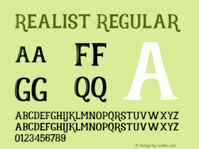
Alternate GothicNo. 2 (used forNormanderound out the type palette, keeping within the retro-industrial theme.

Source: http://extension765.com.License: All Rights Reserved.

Source: http://extension765.com.License: All Rights Reserved.

Source: http://extension765.com.License: All Rights Reserved.


 闽公网安备35010202000240号