


Läckerli Huus


Source: http://www.flickr.com.Uploaded to Flickr by Florian Hardwig and tagged with "fettefraktur". License: All Rights Reserved.
Nina posted this on Twittter before: The new owner of Basel-based confectionery Läckerli-Huus apparently found the Fraktur 'H' unacceptable. It got replaced with a dumb and unskilled hybrid form in the new logo. The 's' lost its fine top swash, and the 'l' was messed with, too. Also, the (double) hyphen had to go.
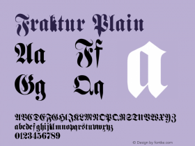
This is not the first time that blackletter peculiarities were sacrificed: In the 1990s, the logo still proudly featured a 'ck' ligature. When the ligature was dissolved, the new 'k' kept its very tiny and high loop – and got an enormous leg.
All logo versions are related to the model ofFette Fraktur. The newest one is derived directly from a digitally available font. By the way, Linotype's Fette Fraktur has the "latinized" 'k' as included in the Läckerli Huus logo, while URW++ and E+F offer the font with the original Fraktur 'k'.

Source: http://www.flickr.com.Pete Shacky. License: All Rights Reserved.

Source: http://www.flickr.com.Julio César Cerletti García. License: CC BY-NC-ND.


 闽公网安备35010202000240号