字体设计基础(14)粗体
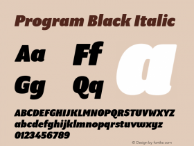
Bold-faced. Since the introduction of the computer, type design has become available to a wide audience like never shown before in history. Of course the digitalization makes many acts easier and particularly faster. This doesn't mean it automatically gets better, but that's another story. For example, many font software programs have included an option to 'bolden up' your regular weight. The outlines of the perfectly designed font get expanded, but the program is trying to fool you. That's not a bold. It's a limousine which got quickly extended by a local blacksmith. The contrast will probably be destroyed (see the second 'a' in the drawing). Doing this by hand will give a much more pleasurable result. No matter how well font software programs will improve in the future, there is only one thing that really counts in the end: your critical eye.
计算机的普及,使得广大的用户得以接触到字体设计,这在以前是从未有过的。数字化让许多操作变得更简单和快捷,但不意味着它会自动的获得更好的结果,那完全是两码事。举个例子,许多字体软件都包含一个字体“加粗”选项,能将原先完美设计的字体轮廓加以扩展。但实际上软件只是在欺骗你。那并非真正的粗体,那只是一辆由村里的铁匠临时改长的“加长型”豪华轿车。笔画的粗细比率可能全被破坏了(见图例中第二个a)。手工操作的结果会更令人满意。不管将来的软件如何进步,最终起决定作用的东西只有一个:你锐利的眼光。







 闽公网安备35010202000240号