


Room & Board 2014 Catalog


Source: http://catalogs.roomandboard.com.License: All Rights Reserved.
For the last few years, the printed catalogs, website, and other identity elements of mid-range furniture supplierAdrianna. As a long-time fan of the company, I've always felt the brand deserved a typeface that better represented the quality of their goods. Adrianna, a pastiche of 20th-century sans serifs like Venus, Adonis and Standard Extra Light Extended, is not well drawn. The italic is essentially a mechanically slanted roman. The typeface is passable In all-caps (as shown on the cover) but the lowercase reveals a lack of craftsmanship unworthy of the company. The long stretches of light, tightly-spaced Adrianna text in this catalog are an unpleasant read.
The catalog and website designers recognize Adrianna is not capable of delivering small text and use Gill Sans for those settings instead. But this too is an odd choice — a very British typeface for an American company that very proudly produces many of its products in its home country.
Room & Board's logo was created in the early 1990s by Pat Thompson under the direction of Julie Weil, the in-house design director at the time. It is a modifiedAdobe Garamondwith a retracted 'R' and ampersand, and a ligated 'ar' to accommodate the tight spacing. It's bland, but ok.
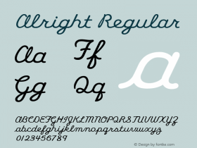
There are plenty of American-made sans serif families that would suit R&B's quiet modernism, contrast with the stuffiness of the logo, and supply the range of styles required for all their communications. They could still source the type straight from the Midwest, where they are based and where much of their furniture is made. The multitude of options include Locator by Eric Olson (in Minnesota), Agenda by Greg Thompson (born in Nebraska), Alright Sans by Jackson Cavanaugh (in Chicago), Proxima Nova by Mark Simonson (in Saint Paul), and Relay or Antenna by Cyrus Highsmith (born in Milwaukee).
And if R&B wants to stick as close to their current wide gothic style as possible, I can't think of a better option than the very American Sweet Sans. (Hat tip to Maxim Leyzerovich for the suggestion.)

Source: http://catalogs.roomandboard.com.© Room & Board. License: All Rights Reserved.

Source: http://catalogs.roomandboard.com.License: All Rights Reserved.

Source: http://catalogs.roomandboard.com.License: All Rights Reserved.

Source: http://catalogs.roomandboard.com.License: All Rights Reserved.


 闽公网安备35010202000240号