My Type of Music: April's Fool 2014 Special

I had been slipping a little when it comes to My Type of Music posts, so it feels good to be back on track, reviewing the covers for recent album releases on The FontFeed. Even though the concept of the music album may sound archaic to anyone under 30, it still is a valid form of art. The selection included in this episode proves that music – now as much as in the past – can be a powerful source of inspiration for beautiful, refreshing, challenging and most of all surprising artwork.

We start this episode with an astonishing example of typography mirroring the image. On Lažno Je, Lažno, Sve Što Je Tvoje the photograph of Serbian song goddess Saveta Jovanović shows uncanny parallels with the extra bold Didone features of Carousel used for her name. I have to confess shivers ran down my spine when it suddenly hit me that the designer paid tribute to Saveta's bulbous hairdo with the bodacious ball terminals, while the delicate hairlines referenced the lush Mediterranean growth adorning the songstress' legs. Rarely have I seen such astute typographic visualisation. Or as Nick Cooke would say, such hirsute typographic visualisation

Don't let Eduardo Davidson's pugilist pose mislead you. He's not here to beat you up; the French title Le Frisson reveals that his intention is to send shivers through not merely your spine but all kinds of other body parts and appendages too. The Bauhaus-inspired extra bold modular display face, somewhat similar to Futura Black, match his chiseled body, while a skyline sans renders the artist's name in proud, erect letters.

American stand-up comedian Murray Roman on the other hand says You Can't Beat People Up and Have Them Say I Love You. He typographically counteracts the brutality of his premise with Windsor, whose delicate outline shapes and gently rounded serifs somehow soften the blows. His main trump card however is appearing to his opponents in kaleidoscopic vision, disorienting them so efficiently that they can't beat him up in return. Thank God for acid!

Thank God for Mike Crain too, though the Karatist Preacher proves quite the contrary on his album cover. Apparently you can beat people up and have them say I love you, as long as you channel that violence to profess God's Power! Witness how his mighty fist crushes the doubts of the non-believers! Witness how the geometric letter forms of Futura symbolise the righteousness of his calling! Witness how God's power prevents people of Asian descent to be insulted by his use of "chop-sooey" typefaces!

The best way to avoid insensitive racial stereotyping is by carefully selecting a typeface that subtly references the desired script. Egytian bad-ass organist Sami Rageb successfully does so with a faux Indic face for Hyetti (Egyptian Music). But… wait a minute, they do use the Devanagari script in Egypt, don't they?

To continue the Arabic theme – Romani folk singer Ljuba Aličić looks perfectly at ease amongst his harem women on Nema Više Harema. This album cover proves once and for all that you don't really need Adobe Photoshop to produce convincing composite images. It is just a tool, just like scissors and glue, and the quality of the end result lies entirely in the capable hands of the designer. The curly details in Davida deftly suggest arabesque motifes. Univers Extra Black 85 is where Adrian Frutiger "goes to eleven" in his classic Modernist sans serif super family.

Any self-respecting music fan evidently knows where that last reference comes from. Fred Weyrich und seine Party-Gäste display their pop culture acumen by also referencing Spinal Tap with the artwork for Ringelpietz mit Anfassen (Die große Überraschungsparty). The German music producer / Schlager lyricist / vocalist's nod to the album Smell The Glove works on an additional level – because Spinal Tap is a heavy metal band, the glove on this sleeve is… indeed, a metal one! Judging from the woman's disapproving, slightly fearful grimace the smelling of the hand garment has already been dealt with. I adore clever stuff like this. And again, the designer shows that you don't need Adobe Illustrator to fluently set Helvetica caps on a curve.

Before Adobe software, there was (and still is) airbrush. Artists mastering this technique manage to craft astonishing, completely believable images, like this album sleeve for Quelque part un aigle from Johnny Hallyday, the Belgian-born "Elvis Presley of France". Yes, through my computer monitor I sense the incredulity in your eyes, but this is not a photograph of a mythical eagle-like creature with a human head carrying a broken guitar in its talons. This was painted! By hand! With paint and air! Such mad airbrush skillz should be ill-eagle! The metalic letters are reminiscent of Baby Teeth, Black Boton, Sinaloa, and other extremely bold geometric display faces.

Even though the effect on the display sans Quicksilver also looks metallic, I would classify the typeface under neon tube-style type. I have the impression Oasis have not been taking very good care themselves since breaking up and apparently reforming (I didn't know they were back together). Liam seems a bit chubby on the album sleeve for Llego Para Quedarse, and the mullets are not very flattering, yet their stage costumes are a big improvement over the plain city clothes they used to wear. The bold letters with sharp serifs of ITC Serif Gothic used for the album title reflect the band's machismo.

If there ever was anyone who does not need the slightest hint of machismo to exert pure, unadulterated animal attraction, that person would be Tino (alias for Constantino Fernández Fernández, formerly singer with Spanish children's group Parchis). On the cover for Por Primera Vez the heartthrob subtly displays his… errr… "assets" barely constrained by his very short jeans shorts, figuratively setting the hearts (and loins) of countless young pop music lovers of both sexes on fire. The distinctly protruding serifs of ITC Bookman symbolise the aforementioned… "assets" I guess.

More Bookman and very short shorts on this album sleeve for American football legend Bill Glass. The original Bookman in all its swashalicious exuberance used on Get "Up" For The Game was restored to its former glory by Mark Simonson with Bookmania. I am not sure inhowfar the swelling end of the extender on the 'y' reaching into the loop created by the swash on the capital 'B' in "by Bill Glass" has any relation to those hormone-driven boys getting "up" for… which game exactly?

We all know that "football" has a totally different meaning in the United States than it has in Europe – the game Americans incorrectly refer to as "soccer". Incorrectly because, really, Europe is where we strike the ball with the foot, hence "football", unlike the US where the players frantically run around carrying the ball in their hands. Nitpicking aside, I am in awe at how sports photographers can capture those split-second moves. On the cover for Ti Saluto Italia Balkan actress and turbo-folk singer Snežana Babić a.k.a. Sneki is caught on camera when graciously yet vigorously lunging for the ball, stopping it with her knee just outside the goal posts. I would be a little more careful if I was her, because she has had those legs insured for one million euro. Each! The designer did an excellent job with the typography, filling Sneki's name in Antique Olive-like letters with – wait for it – the Italian flag! Even though technically speaking this is the Iranian flag pre-1980. Or an upside-down Hungarian flag if you will. The sans caps at the bottom are the original Kabel, not the ITC version.

Briard is considered to be the first Finnish punk band. The model on the cover for their Miss World reunion album shows as much leg as Sneki – and more! – but I doubt those are insured. The sensual elegance of the photograph is echoed in the copperplate script Palace Script; the playful innocence of the child-like hand-printed sans restores the balance in the artwork, narrowly avoiding a fatal overload in erotic tension.

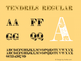
Do I also sense a certain erotic tension between Geraldine and Ricky? No wonder their album is called Trees Talk Too – Ricky must have had no problems convincing Geraldine when he reasons with her in her head: he talks, doesn't he? And he is made of wood, and wood comes from trees, hence trees talk too. Just like chocolate is made from cocoa beans, and cocoa is a plant, hence chocolate counts as a vegetable, just like salad. Isn't life great when all the pieces come together and everything starts to make sense? The typography beautifully fits the vegetable theme. The sinuous Art Nouveau tendrils of Arnold Böcklin were inspired by motifs found in plants and flowers. Just like in chocolate. And in trees. That talk too. What did you just say, Ricky? Which knife?

Not only ventriloquist's dummies make perfect companions. South African songwriter and singer John Godfrey Owen "Paddy" Roberts testifies his love for his canine friends in Songs for Gay Dogs. The gay-ness of the dogs is lovingly interpreted by the swash capitals of Caslon 540 Italic.

We end this April's Fool episode with two album covers that beautifully express the innocent love of certain artists for children. The question in Paul Quinlan's Love and A Question could for example be the boy asking what exactly is in the water. Well, I sure hope it isn't "Why do I have to keep this position while you get behind me?" The round, gooey letter forms of Lazybones used for the album title link the typography to the "liquid" element in the image. The Christian radio artist's name is set in Parsons, designed by Will Ransom for Barnhart Brothers & Spindler in the early 1900s, and named after the advertising director of a Chicago department store, obviously an important customer of BB&S.

And the last record sleeve is an incredibly touching one. On the title track of Watch Over My Little Girl The Vibrators, one of Pittsburgh's more popular pop-rock acts, sing about a terminally ill widower who implores the man above to take care of his little girl when he's gone. It is very moving to see the band re-enact the album title rather literally. They huddle around the little girl in order to protect the innocent child from creepy middle-aged men.
The precursor of Bookmania spells out the album title in curly swashes, and the horizontal stripes inside the hot dog type reference the vibrations in the band name.
My gratitude goes out to the administrator and visitors of Awkward Band and Musicians Photos for providing both the content for this April's Fool post and countless moments of merriment.







 闽公网安备35010202000240号