Magical Magma II

Natural beauty speaks for itself. When we see a full moon, a ripe peach, or a smooth round pebble on the beach, their simple shapes touch something significant inside us. Man-made objects such as letters can create a similar inner resonance. A perfectly balanced 'g' or a subtly crafted 'O,' can evoke a delicate but powerful aesthetic experience. Unfortunately, few letter shapes elicit this response.
Just to begin to qualify, the letters must have certain fundamental properties. For instance, they must have pleasing proportions between the weight of the stems and the size of the counters. The curved strokes must be both graceful and strong. The swelling of the curves must be subtle and consistent. Other proportions, such as the relationship between height, width, and stem weight must be harmonious.

But creating these relationships does not in itself guarantee that the form will possess the desired magic. Master craftsmanship transcends measurement. Only careful observation and intensive practice will lead the designer to synergetic forms. Type designers must continually ratchet their skills upward in order to reach the point where their letters attain the kind of beauty we see in the night sky, the orchard, or at the beach.
Sans serif typeface designs are not generally known for their beauty. They are for the most part primarily notable for their reliability and sturdiness. They are safe. They work. They are plumbing. Only a few sans serifs fulfill this functional role and yet also have forms that reach the aesthetic level described above. My goal in designing theMagma™ II typeface was to create one of those designs.
Magma II is the latest installment in a project that has been ongoing for two decades. This typeface family has its head in the night sky, and its feet firmly on the ground. It is intended to be both charismatic and practical. Large sizes have the ability to charm. At the same time, long passages of text have an inviting presence, and with its alternate one-story 'a'and 'g'it shines even at very small sizes.

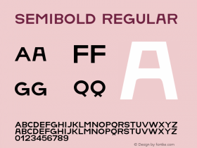
The Magma family has five weights –thin, light, regular, semibold and bold. The thin weight is especially effective for display. The other four weights can be used for both text and display over a very large range of sizes. The skeletons of the capitals are closely related to the proportions of the Adobe Trajan® typeface, a design I art directed at Adobe Systems. The skeletons of the lower case forms are closely related to those of Garamond.

Magma II is part of the Magma superfamily which also includes the Magma Compressed family, the Magma Condensed family, the Munc family, the Tuff family and Basalt. These typefaces are all harmonious companions. They can be used together to create distinctive, integrated typographic compositions for everything from logotypes to books. Styles can be mixed together within a single word.
Magma II is magical. Let it cast a typographic spell for you.





 闽公网安备35010202000240号