


Midnight Sailing


Source: https://www.flickr.com.scanned and retouched by Paul Malon. License: All Rights Reserved.
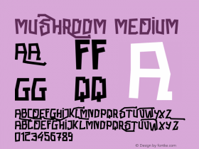
American ad for North German Lloyd's transatlantic sea passages from 1936, inElementschmalfett (1934). While there apparently was the desire to convey a deliberate teutonic look by using one of the new streamlined texturas which mushroomed in the first years of the Third Reich, Element's gotisch 'H' was considered to be too much, and illegible to American eyes: It got replaced by a romanized creation with a clunky foot swash. The long 's' (ſ) has been foregone, too.
On a related note, the final letter with straight descender in the shaded upright script — which provides a classy contrast, and likely is not a font — would probably pass for a 'g' only in the US, cf. the Berghoff sign.


 闽公网安备35010202000240号