


Hillary for America website and logo


Source: https://www.hillaryclinton.com.License: All Rights Reserved.
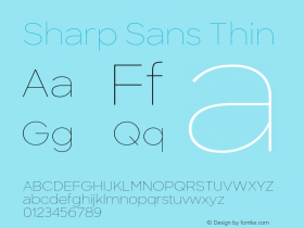
Hillary Clinton's 2016 presidential campaign launched today with aSharp Sansby Lucas Sharp.Mercuryis used for the quotation on the front page.
It is clear to see the Barack Obama campaign's influence on US politics ever since it debuted in 2008. In the years that followed, candidates Gotham was a consistent favorite. With Sharp Sans, the Clinton campaign chose a design in a very similar vein: an unadorned Geometric sans with a large x-height and regularized letter widths. One difference is this site's more frequent use of lowercase, striking a friendlier tone than the commanding, authoritative all-caps of Obama 2008 and its followers.
The Hillary identity and website are not yet as refined as its models. There are two Obama's initial identity wasn't as iconic as its revision.

Source: https://www.hillaryclinton.com.License: All Rights Reserved.

Source: https://www.hillaryclinton.com.License: All Rights Reserved.

Source: https://www.hillaryclinton.com.License: All Rights Reserved.
Words that are tight-but-not-touching accentuate uneven spacing, such as the gap between 'r' and 'y' in "Hillary". A more comfortable rhythm is found in looser settings like "hillaryclinton.com".


 闽公网安备35010202000240号