


FontBook, A New Way Of Combining & Comparing And Sharing Typefaces


One of the major advantages of the FontBook app in comparison to the previous printed editions is that it allows easy combining and comparing of typefaces, as well as one-click sharing over Facebook, Twitter and email. Here's a little tutorial to get you acquainted with the new functionalities.
You can purchase the FontBook app for iPad in the iTunes App Store.

For this example I want to compare three textured scripts. I started by browsing through the Sudtipos collection, looking for the right balance between spontaneous and designed, with nicely grainy character outlines. The offerings of this foundry can be accessed in two ways. One is by tapping the Foundry field on the FontBook home page, then tapping the Sudtipos field.

You can also use the full text Search, which can be accessed by tapping the magnifying glass icon at the right hand side in the top menu bar.
My Favorites

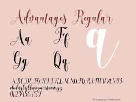
The first typeface to my liking is Alma, a wild-natured script originating from the creative jungle in Angel Koziupa's mind, and engineered by Alejandro Paul.

To be able to combine and compare Alma with other type designs I need to add it to My Favorites. This can be done by tapping the Star icon at the right hand side in the top menu bar. Enjoy the animation.

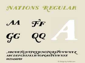
I can search for other typefaces by the same designers by browsing through the list in the left vertical column. The second candidate is Galgo Script, a mix of elegant brush calligraphy and the rough, weathered strokes of speedy scrawl. I also add this one to My Favorites by tapping the Star icon.

Tiza, a rough take on informal faces and handwriting, simulating runny pen ink, is the third typeface to be added to My Favorites. I could go on, but for this tutorial three is enough.

As Tiza has more than one style – Regular and Negra – a round yellow circle with a Play icon has appeared on the sample page. Tapping this icon makes the different styles within a type family automatically alternate in the three samples. Tapping the yellow circle again makes the animation stop.

You can also switch between type styles within a type family by vertically swiping any or all of the three samples.

To access the Share Screen and Compare options tap the cross in the upper right corner of the screen. It rotates to reveal a vertical menu at the right hand side of the main screen.
Sharing

Before we continue with Combine & Compare let's take a quick look at the Share Screen options. They are pretty much self-explanatory. The vertical menu at the right hand side of the main screen is divided in a top area and a bottom area. The top area holds all the sharing options: [1] Share screen on Facebook, [2] Share screen on Twitter, [3] Send screen via email, and [4] Save screen in Photo Library.

One-click sharing on Facebook – tap the Facebook button, tap "OK" and the screen is posted to your Facebook Wall.

One-click sharing on Twitter – tap the Twitter button, tap "OK" and the screen is posted to your Twitter stream.

One-click sharing via email – tap the email button, enter email address and subject line, and the screen is sent via email.

One-clicking saving of screens – tap the Photo Library button, tap "OK" and the screen is saved to your Photo Library.
Combining and Comparing

But now back to the three typefaces saved in My Favorites. Tapping the button in the bottom area of the vertical menu at the right hand side of the main screen brings up the Combine & Compare screen.

The Combine & Compare screen shows all my favourites in the left hand vertical column. What you see are the type families, not the actual fonts. To bring up the individual fonts you must first tap the family to bring up the individual fonts, which can then be dragged into the Combine & Compare area.

In the case of Alma and Galgo Script each family only has one style, so only one single font to be dragged into the Combine & Compare area. Tiza however has two styles – Regular and Negra. As I want to compare the Regular weight with the other two scripts I drag it into its spot.

If you want to remove a type family from My Favorites, left-swipe the typeface name and a Delete button appears. Tap it to delete the type family from the list.

The Combine & Compare screen comes with a number of preset colour combinations for both type and background. Different colours can be brought up by swiping the samples horizontally.

To edit the default text, bring up the keyboard by tapping the Pencil icon.

Enter the text of your choice in the Customize Headline field. You can always revert to the default by tapping Standard Text.

And this concludes our FontBook Combine & Compare / Share tutorial. If you have any questions, please consult the FontBook iPad App – FAQs on the FontShop Blog first. If anything remains unclear use the comments section below.


 闽公网安备35010202000240号