


Courrier International


Courrier International. Click to enlarge.

"Long Courrier" arts and entertainment section. Click to enlarge.
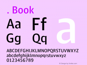
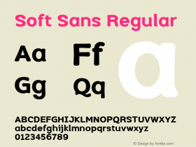
Mark Porter's first gig since leaving The Guardian — where he led a groundbreaking redesign — is Courrier International, a newsprint magazine published in Paris. The collaboration with Mark Leeds is a striking design both in its color (caution yellow for this first issue) and its typography, featuring Joshua Darden'sOmnesandFreight.

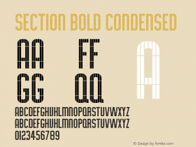
Omnes and Freight typefaces by Joshua Darden
Omnes is the kind of doughy, cheerful face that you would never choose for news, but Porter took a chance and makes it work. Perhaps because Freight is such a good pairing. Folks are always asking how to pick typefaces that work together. One method is to look for contrast. Courrier takes that to the max, pairing a heavy, soft sans with the angular, thick-thin serif. The two typefaces have nothing to do with each other — other than being well made — but it's a happy marriage.
Like many other Freight users, the designers found that Micro, an unsual subfamily designed for very small text, makes for interesting headline type too.

Omnes and Freight Micro in Courrier International, September 2010

Courrier International, September 2010. Click to enlarge.

Courrier International, September 2010


 闽公网安备35010202000240号