


Established & Sons


Established & Sons catalog, featuring the identity designed by MadeThought.
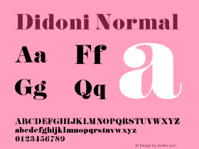
Didoniis a mix of "fat faces" from the early 19th century and ultra bold moderns of the 1960s and '70s — the kind of mashup that wasn't uncommon for eccentric type maker Phil Martin. It's also a concoction that today's young designers find irresistible. I've seen a lot of high contrast serifs likeCaslon Graphique,ITC Caslon 224,Pistilli Roman, andITC Grouchin the last couple of years.

The Established & Sons identity at work at the Milan Furniture Fair in 2006. Click to enlarge.
Didoni may be the least goofy or showy of these, but it still packs a lot of personality. It has enough character, when used well, to carry a brand identity all by itself. That is the case with Established & Sons, a high-end furniture label in the UK. Despite its dated references, when combined with pristine photographs of ultra contemporary furniture, Didoni feels quite current. MadeThought created the identity in 2005 — long before the extra bold serif trend — but it's their more recent implementation on E&S's new website that is most impressive.


The online catalog presents one object per screen, many laid over witty phrases set in the brand typeface. This is striking on its own, but there's an occasional element of pleasant surprise when the letters interact with the furniture, weaving between chair legs or reflecting on a glossy table.

Click to enlarge.

Click to enlarge.

Click to enlarge.

Click to enlarge.

Click to enlarge.

Click to enlarge.

MadeThought created a stencilized version of Didoni for E&S's subbrand, Estd.

AW ARDS or AWARDS?
There are just a couple of missteps in the site. First, it's built in Flash — a mistake that can be forgiven since it was made a year ago, but it means sacrifices in load time and accessibility. The only typographic negligence is found in some of the smaller headlines where less care was taken to fix URW Didoni's inadequate kerning.


 闽公网安备35010202000240号