Central Park Sydney


Source: http://frostdesign.com.au.License: All Rights Reserved.
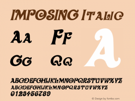
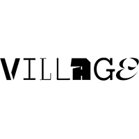
Love the lP ligature – lower-and uppercase unite! I assume the k is custom-made, and not included in the font. This way, it is more similar to the k in FF Ernestine.
See more images in the Frost* blog.
Frasers property commisioned Frost* to create a Brand Identity and collateral, including promotional brochure, website and display pavilion for the $2 billion redevelopment of the old Carlton Brewery site in Sydney.
Our strategy for Central Park focusses on the vision of a diverse collective of individuals, joining together to create a global village.
This strategic vision of 'coming together' underpins all visual communications. The identity highlights each letter in Central Park with a different colour, representing the convergence of different people and elements to form a whole. The brochure features portraits of the visionary architects and designers, paired with photos of local people to communicate the vibrant diversity Central Park will bring to the area.
Huge 3D letters create imposing signage at the front of the display pavilion. A highly engaging website features an interactive map where users can explore the master plan, look at the architecture and experience the multiple benefits of the location, including proximity to transport and entertainment and lifestyle destinations.
http://frostdesign.com.au/wordpress/case-studies/central-park/

Source: http://frostdesign.com.au.License: All Rights Reserved.

Source: http://frostdesign.com.au.License: All Rights Reserved.

Source: http://frostdesign.com.au.License: All Rights Reserved.







 闽公网安备35010202000240号