


Deutsche Guggenheim Magazine


Deutsche Guggenheim is a collaboration between Deutsche Bank and the Solomon R. Guggenheim Foundation. The Berlin exhibition hall on the Unter den Linden boulevard opened up in 1997. For 15 years, it has been a member of the international Guggenheim network that consists of the original museum in New York City and spin-offs in Venice, Bilbao, and — from 2017 — Abu Dhabi. The Berlin branch, however, will be closed this winter, as the two partners agreed to end their liaison. The final exhibition, Visions of modernity, features works by Paul Cézanne, Robert Delaunay, Wassily Kandinsky, Pablo Picasso, and others. It is on display through February 17, 2013.

Both languages are set in the same weight and size. German text is in black, English in a lighter grey. The division is sometimes horizontal (in columns), sometimes vertical.
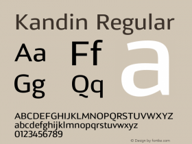
The Deutsche Guggenheim Magazine has been published on a quarterly basis since late 2007. Each of its 21 issues make for a useful bilingual specimen ofVerlag. As you would expect from such a prestigious institution, the design is not exactly adventurous, but very tidy and flawless, and supported by top-notch imagery. Verlag started life as a commission for the NYC Guggenheim museum. Its elegant geometric shapes are based on Frank Lloyd Wright's Art Deco lettering on the facade of the building.
In 1996, when designing the Guggenheim magazine, Abbott Miller (of Pentagram) approached Jonathan Hoefler (of Hoefler & Frere-Jones) to create a custom typeface for the publication. Hoefler referenced Wright's iconic lettering and designed the custom typeface in various weights and italic and bold versions for exclusive use in the magazine.—idsgn.org
Ten years later, the original six styles were expanded into a complete family spanning five weights in three widths, and made available for retail.

The eszett in Erbar Grotesk accentuates the provenance from long s (ſ) plus descending z (ʒ).
The Berlin museum will live on as "Deutsche Bank KunstHalle", without participation from Guggenheim, and hence very likely without a magazine set in Verlag. That's a pity. I find that German words look especially good in this typeface, with its eszett that nods to 1920s Erbar Grotesk.

The headline is set in Verlag Bold, 66 pt., followed by a subhead in the Book weight, 22 pt. The body text is in 9.6 pt. Verlag Book. Note the short lining figures which blend well with the low x-height. They are also perfectly suited to integrate the many figures in image captions.

In this closeup view, two pecularities can be observed: Apart from the aforementioned eszett (regelmäßig in line 6, and große in the fourth-to-last line), there are also examples for „German quotes".


 闽公网安备35010202000240号