


+ 关注
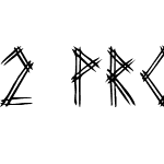 2 Prong Tree Regular1.0 (5/24/97)

2 Prong Tree Regular 字体主要参数
| 字体家族: | 2 Prong Tree |
| 字体风格: | |
| 字体版本: | 1.0 (5/24/97) |
| 书体类型: | |
| 字符数: | 128 |
| 字形数: | 113 |
| 字重: | |
| 字宽: | |
| 文字: | |
| 区块: | |
| 来源类型: | |
| 文件格式: | |
| 授权方式: | |
| 字体嵌入许可: | |
| 字体公司: |

2 Prong Tree Regular 名称参数
微软 - 英语(美国)
| 版权信息: | Another Freeware font from UnAuthorized Type |
| 字体家族名称: | 2 Prong Tree |
| 字体子家族名称: | Regular |
| 统一字体标识: | Macromedia Fontographer 4.1 2 Prong Tree |
| 字体全名: | 2 Prong Tree |
| 版本: | 1.0 (5/24/97) |
| PostScript名称: | 2ProngTree |
| 商标信息: | UnAuthorized Type |
| 制造商信息: | UnAuthorized Type |
| 设计师: | Ben McGehee |
| 描述: | This version includes only capital letters, and some commonly used punctuation. plus the new UA Type dingbat (just to amuse myself). When I was sitting in Huddle House one night, drinking coffee, I was showing my girlfriend the fonts I was working on. I drew out 3-Prong Tree, and she said that she didn't like it. She told me to do it with just 2 lines on every letter. So I tried that with this one. She realized after the finished product of 3-Prong Tree that it was good, but I went on and did 2-Prong Tree just to see the difference. 3-Prong looks better at smaller point sizes (because it's fatter), but 2-Prong Tree looks better at larger point sizes (because the letters are cleaner). |
| 供应商网址: | http://www.latech.edu/~bmcgehee/untype/index.htm |
| 设计师网址: | mailto:bmcgehee@engr.latech.edu |
| 许可证描述: | You use this font in any way that you see fit. If you distribute it, I would like for the readme text file to accompany it. (That's just so they know who made it.) You may distribute it on CD, disk, or any other medium, but you may not sell it. |
2 Prong Tree Regular 度量参数
| 每em像素单位: | 1000 | 上标水平字体大小: | 700 |
| 水平最小值: | -17 | 上标垂直字体大小: | 650 |
| 垂直最小值: | -198 | 上标水平偏移 | 0 |
| 水平最大值: | 863 | 上标垂直偏移 | 143 |
| 垂直最大值: | 807 | 下标水平字体大小: | 700 |
| Mac风格: | 0 | 下标垂直字体大小: | 650 |
| 最小可读像素大小: | 8 | 下标水平偏移: | 0 |
| 字体方向Hint: | 2 | 下标垂直偏移: | 453 |
| 升部: | 807 | 删除线大小: | 50 |
| 降部: | -200 | 删除线位置: | 259 |
| 行间距: | 0 | 字体选择标识: | 64 |
| 最大步进宽度: | 903 | 字体排印升部: | 807 |
| 最小左跨距: | -17 | 字体排印降部: | -198 |
| 最小右跨距: | 0 | 字体排印行间距: | 0 |
| 水平最大宽度: | 863 | Windows升部: | 807 |
| 非复合字形最大点: | 293 | Windows降部: | 198 |
| 非复合字形最大轮廓: | 22 | 斜角: | 0 |
| 字重类型: | 400 | 下划线位置: | -133 |
| 字宽类型: | 5 | 下划线厚度: | 20 |


推荐字体
 闽公网安备35010202000240号