


+ 关注
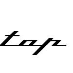 Top Speed RegularVersion 1.41

Top Speed Regular 字体主要参数
| 字体家族: | Top Speed |
| 字体风格: | |
| 字体版本: | Version 1.41 |
| 书体类型: | |
| 字符数: | 90 |
| 字形数: | 91 |
| 字重: | |
| 字宽: | |
| 文字: | |
| 区块: | |
| 来源类型: | |
| 文件格式: | |
| 授权方式: | |
| 字体嵌入许可: | |
| 字体设计师: |

Top Speed Regular 名称参数
微软 - 英语(美国)
| 版权信息: | Copyright 1997 Jason Vanderhill |
| 字体家族名称: | Top Speed |
| 字体子家族名称: | Regular |
| 统一字体标识: | Top Speed |
| 字体全名: | Top Speed |
| 版本: | Version 1.41 |
| PostScript名称: | TopSpeed |
| 制造商信息: | Jason Vanderhill |
| 设计师: | Jason Vanderhill |
| 描述: | Top Speed Version 1.41 Released as Shareware December 1997 Copyright 1997 Jason Vanderhill Top Speed is inspired by a certain metal badge seen on the flanks of the finest coachbuilt automobiles in the world. It is a complete alphabet, albeit all lower case at the moment, based on the letters p, i, n, f, a, and r. Top Speed Version 1.41 is currently available as shareware. For $10, you are entitled to a single-user licence for Top Speed Normal, Top Speed Outline, and Top Speed Heavy. Please send a cheque or money order to: Jason Vanderhill R.R. #1 Dorchester, ON N0L 1G4 canada Feel free to email me at vanderhr@skyia.com ___________________________________ ...about Top Speed... ___________________________________ Top Speed is strictly a display typeface, and should be used for no more than one line--preferably only one or two words--at a time. The most distinctive feature of Top Speed is the fact that all the letterforms are connected to each other. To maintain this look, all the characters have tails. The forward-slash character (and underline character) can be inserted between words instead of using the space bar, maintaining the continuous baseline. The back-slash character is a somewhat shorter connector; the '|' key is a slightly longer connector. To begin your word or line of text, you should insert a small version of the baseline, which is the "<" character. This will start off your type with an appropriate "tail." To finish off your line of type, use the ">" character, as it will end your tail at the appropriate distance. These characters are more necessary in the Outline version of the font. Top Speed may require minor kerning adjustment with some characters. Because each letter must be placed EXACTLY next to the following letter, (Top Speed Normal and Heavy are slightly more forgiving) you might notice a sliver appear between an occasional pair of letters. There are no differences in the capital letters except for the letter F. The capital letter F does not continue along the baseline, but instead it can run into certain letters (typically, the a, o, or u) through it's horizontal crossed stroke. The Outline version of the capital F contains an extra bit of black. This fills up the "hole" left at the beginning of the next character. If the capital F is used to end a word or sentence using Top Speed Outline, that little speck will have to somehow be creatively covered up. Top Speed is my first computer designed typeface. It was created completely in CorelDraw 7. Since this was my first font, I did stumble through the whole process a bit, and as a result, it does contain the odd imperfection. For example, I am not sure how to get my apostrophes and quotation marks to work. Currently, the null character is inserted instead. In a way, it's a bit of a handmade product. I began the font in the spring, basically ignored it all summer, and then finished it in the fall. Mostly, it has been fun. I hope you enjoy it. ___________________________________ The typeface name 'Top Speed' has been registered at the Goudy International Typeface Center in Rochester, New York, 1997. This font may not be sold or modified without my consent. Top Speed may not be distributed without this text file (or embedded description). ___________________________________ =================================== Thanks: Kikita Eric Wiley Fredi Valentini Laurence Penney J. Kimble Rigney Jim Marsteller Lightwings@aol Stu Henlis Vince Ondrade Derek Timmerman Jeff Harris Nicole Fritz =================================== |
| 供应商网址: | mailto:vanderhr@skyia.com |
| 设计师网址: | mailto:vanderhr@skyia.com |
Top Speed Regular 度量参数
| 每em像素单位: | 2048 | 上标水平字体大小: | 0 |
| 水平最小值: | -1011 | 上标垂直字体大小: | 0 |
| 垂直最小值: | -588 | 上标水平偏移 | 0 |
| 水平最大值: | 1991 | 上标垂直偏移 | 0 |
| 垂直最大值: | 1620 | 下标水平字体大小: | 0 |
| Mac风格: | 0 | 下标垂直字体大小: | 0 |
| 最小可读像素大小: | 8 | 下标水平偏移: | 0 |
| 字体方向Hint: | 2 | 下标垂直偏移: | 0 |
| 升部: | 1620 | 删除线大小: | 0 |
| 降部: | -588 | 删除线位置: | 0 |
| 行间距: | 0 | 字体选择标识: | 64 |
| 最大步进宽度: | 2048 | 字体排印升部: | 1620 |
| 最小左跨距: | -1011 | 字体排印降部: | -588 |
| 最小右跨距: | -740 | 字体排印行间距: | 0 |
| 水平最大宽度: | 1991 | Windows升部: | 1620 |
| 非复合字形最大点: | 32 | Windows降部: | 588 |
| 非复合字形最大轮廓: | 3 | 斜角: | 0 |
| 字重类型: | 400 | 下划线位置: | 0 |
| 字宽类型: | 5 | 下划线厚度: | 0 |


推荐字体
 闽公网安备35010202000240号