


字客网>字体>VereDignumLTStd-Decorative ☞ Version 2.100;PS 002.001;hotconv 1.0.38;com.myfonts.easy.linotype.vere-dignum.decorative.wfkit2.version.53fs
+ 关注
 VereDignumLTStd-Decorative ☞Version 2.100;PS 002.001;hotconv 1.0.38;com.myfonts.easy.linotype.vere-dignum.decorative.wfkit2.version.53fs

VereDignumLTStd-Decorative ☞ 字体主要参数
| 字体家族: | VereDignumLTStd-Decorative |
| 字体风格: | |
| 字体版本: | Version 2.100;PS 002.001;hotconv 1.0.38;com.myfonts.easy.linotype.vere-dignum.decorative.wfkit2.version.53fs |
| 书体类型: | |
| 字符数: | 86 |
| 字形数: | 80 |
| 字重: | |
| 字宽: | |
| 文字: | |
| 区块: | |
| 来源类型: | |
| 文件格式: | |
| 授权方式: | |
| 字体嵌入许可: |

VereDignumLTStd-Decorative ☞ 名称参数
微软 - 英语(美国)
| 版权信息: | Copyright © 2003 - 2008 Linotype GmbH, www.linotype.com. All rights reserved. This font software may not be reproduced, modified, disclosed or transferred without the express written approval of Linotype GmbH. Vere Dignum is a trademark of Linotype GmbH and may be registered in certain jurisdictions. This typeface is original artwork of Phil Baines. The design may be protected in certain jurisdictions. |
| 字体家族名称: | VereDignumLTStd-Decorative |
| 字体子家族名称: | ☞ |
| 统一字体标识: | com.myfonts.easy.linotype.vere-dignum.decorative.wfkit2.version.53fs |
| 字体全名: | ☞VereDignumLTStd-Decorative |
| 版本: | Version 2.100;PS 002.001;hotconv 1.0.38;com.myfonts.easy.linotype.vere-dignum.decorative.wfkit2.version.53fs |
| PostScript名称: | VereDignumLTStd-Decorative |
| 商标信息: | Vere Dignum is a trademark of Linotype GmbH and may be registered in certain jurisdictions. |
| 制造商信息: | Linotype GmbH |
| 设计师: | Phil Baines |
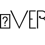
| 描述: | Vere Dignum is a courageous collection of six alphabets, compiled into a family of three typefaces. The family seems to have been influenced by many wide ranging sources, including modernist geometric sans serifs (i.e., Erbar, Avenir, and ITC Avant Garde Gothic, classical monumental lettering, art nouveau, and art deco. The first of the three fonts, Vere Dignum Regular, contains two different interpretations of the alphabet. Both of them display uppercase letters only. When one types with "uppercase" letters on the keyboard, letters appear in various different sizes relative to each other. For example, e, h, o, and s are only half as tall as the other letters. Typing with the "lowercase" keys on the keyboard brings a different alphabet style, but in this one, all of the letters have the same height - it is their widths that vary. C, D, G, O, and Q are much wider than the other letters. Vere Dignum Regular contains a complete character set. Similarly, Vere Dignum Alternates contains another two alphabets. Many of these letters are very different from those in Vere Dignum Regular. These letters may all be used in combination with one another to create crazy lines of display text! Vere Dignum Decorative contains the last two alphabets of this series. As their name implies, these alphabets are significantly more "decorative" than their two counterparts. They are rounder and more curvilinear. All three fonts in the Vere Dignum family consist of letters that are drawn with almost mono-weight lines. Text set in Vere Dignum appears very light, as these lines are thin. Vere Dignum is best in for larger point sizes, but its display purposes need not be "dignified." A funky or fresh setting would be just as appropriate. The Vere Dignum family was designed in 2002 by the British graphic designer Phil Baines, and all three of its fonts are part of the Take Type 5 collection, from Linotype GmbH. |
| 供应商网址: | http://www.linotype.com |
| 设计师网址: | http://www.linotype.com/fontdesigners |
VereDignumLTStd-Decorative ☞ 度量参数
| 每em像素单位: | 1000 | 上标水平字体大小: | 650 |
| 水平最小值: | -41 | 上标垂直字体大小: | 600 |
| 垂直最小值: | -142 | 上标水平偏移 | 0 |
| 水平最大值: | 1310 | 上标垂直偏移 | 75 |
| 垂直最大值: | 1000 | 下标水平字体大小: | 700 |
| Mac风格: | 0 | 下标垂直字体大小: | 650 |
| 最小可读像素大小: | 8 | 下标水平偏移: | 0 |
| 字体方向Hint: | 2 | 下标垂直偏移: | 477 |
| 升部: | 867 | 删除线大小: | 50 |
| 降部: | -133 | 删除线位置: | 250 |
| 行间距: | 500 | 字体选择标识: | 64 |
| 最大步进宽度: | 1320 | 字体排印升部: | 867 |
| 最小左跨距: | -41 | 字体排印降部: | -133 |
| 最小右跨距: | -355 | 字体排印行间距: | 500 |
| 水平最大宽度: | 1310 | Windows升部: | 1349 |
| 非复合字形最大点: | 91 | Windows降部: | 151 |
| 非复合字形最大轮廓: | 9 | 斜角: | 0 |
| 字重类型: | 400 | 下划线位置: | -75 |
| 字宽类型: | 5 | 下划线厚度: | 50 |


推荐字体
 闽公网安备35010202000240号