


+ 关注
 Versailles LT Std 76 Bold ItalicVersion 1.000 Build 1000

| 字体家族: | Versailles LT Std |
| 字体风格: | |
| 字体版本: | Version 1.000 Build 1000 |
| 书体类型: | |
| 字符数: | 286 |
| 字形数: | 266 |
| 字重: | |
| 字宽: | |
| 文字: | |
| 区块: | |
| 来源类型: | |
| 文件格式: | |
| 授权方式: | |
| 字体嵌入许可: | |
| 字体公司: | |
| 字体设计师: |

Versailles LT Std 76 Bold Italic 名称参数
微软 - 英语(美国)
| 版权信息: | Copyright © 2016 Monotype Imaging Inc. All rights reserved. |
| 字体家族名称: | Versailles LT Std |
| 字体子家族名称: | Bold Italic |
| 统一字体标识: | Monotype Imaging Inc.:Versailles LT Std 76 Bold Italic:2016 |
| 字体全名: | VersaillesLTStd-BoldItalic |
| 版本: | Version 1.000 Build 1000 |
| PostScript名称: | VersaillesLTStd-BoldItalic |
| 商标信息: | Versailles is a trademark of Monotype Imaging Inc. and may be registered in certain other jurisdictions. |
| 制造商信息: | Monotype Imaging Inc. |
| 设计师: | Adrian Frutiger |
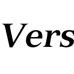
| 描述: | Adrian Frutiger designed Versailles™ for Linotype in 1984. He was influenced by lettering cut in metal on a memorial for Charles Garnier, the designer of the Paris Opera building in 1861. This style of lettering, called French Latine, is characterized by very sharp triangular serifs. The Versailles typeface evokes that time and place: it has a symmetrical, almost vertical axis; a tall x-height, and serifs so sharp they could draw blood. This sharpness contrasts nicely with neo-baroque elements such as the flat-but-curvy overhangs on the a, f, g, j and y. Versailles is perfect for shorter texts and titles or headlines. When used in large sizes or in the bolder weights, it has an astonishing impact. Let it perform on opera posters, websites and advertising banners. |
| 供应商网址: | http://www.monotype.com/ |
| 设计师网址: | http://www.monotype.com/ |
| 许可证网址: | http://www.monotype.com/ |
| 首选家族名称: | Versailles LT Std |
| 首选子家族名称: | 76 Bold Italic |
| WWS家族名称: | Versailles LT Com |
| WWS子家族名称: | Bold Italic |
Versailles LT Std 76 Bold Italic 度量参数
| 每em像素单位: | 1000 | 上标水平字体大小: | 650 |
| 水平最小值: | -179 | 上标垂直字体大小: | 600 |
| 垂直最小值: | -250 | 上标水平偏移 | -16 |
| 水平最大值: | 1203 | 上标垂直偏移 | 75 |
| 垂直最大值: | 963 | 下标水平字体大小: | 650 |
| Mac风格: | 3 | 下标垂直字体大小: | 600 |
| 最小可读像素大小: | 3 | 下标水平偏移: | 74 |
| 字体方向Hint: | 2 | 下标垂直偏移: | 350 |
| 升部: | 712 | 删除线大小: | 50 |
| 降部: | -288 | 删除线位置: | 297 |
| 行间距: | 200 | 字体选择标识: | 161 |
| 最大步进宽度: | 1111 | 字体排印升部: | 712 |
| 最小左跨距: | -179 | 字体排印降部: | -288 |
| 最小右跨距: | -238 | 字体排印行间距: | 200 |
| 水平最大宽度: | 1203 | Windows升部: | 963 |
| 非复合字形最大点: | 0 | Windows降部: | 250 |
| 非复合字形最大轮廓: | 0 | 斜角: | -786432 |
| 字重类型: | 700 | 下划线位置: | -75 |
| 字宽类型: | 5 | 下划线厚度: | 50 |


- ·Versailles LT Std Italic
- ·Versailles LT Std Bold Italic
- ·Versailles LT Std Bold
- ·Versailles LT Std 96 Black Italic
- ·Versailles LT Std 95 Black
- ·Versailles LT Std Regular
- ·Versailles LT Std 46 Light Italic
- ·Versailles LT Std 45 Light
- ·Versailles LT Std 55 Roman
- ·Versailles LT Std 46 Light Italic
- ·Versailles LT Std 45 Light
- ·Versailles LT Std 56 Italic
- ·Versailles LT Std 76 Bold Italic
- ·Versailles LT Std 75 Bold
- ·Versailles LT Std 96 Black Italic
- ·Versailles LT Std 95 Black
- ·Versailles LT Std Regular
- ·Versailles LT Std 46 Light Italic
- ·Versailles LT Std 45 Light
- ·Versailles LT Std Italic

- ·Versailles LT Std Bold Italic Version 2.086;PS 005.000;hotconv 1.0.67;makeotf.lib2.5.33168
- ·Versailles LT Std 76 Bold Italic Version 1.000 Build 1000
- ·Versailles LT Std Bold Italic Version 2.086;PS 005.000;hotconv 1.0.67;makeotf.lib2.5.33168
- ·Versailles LT Std 76 Bold Italic Version 1.000 Build 1000
- ·Versailles LT Std 76 Bold Italic Version 1.000 Build 1000
- ·Versailles LT Std 76 Bold Italic Version 1.000 Build 1000
- ·Versailles LT Std Bold Italic Version 2.086;PS 005.000;hotconv 1.0.67;makeotf.lib2.5.33168
- ·Versailles LT Std Bold Italic Version 2.020;PS 002.000;hotconv 1.0.50;makeotf.lib2.0.16970
- ·Versailles LT Std 76 Bold Italic Version 1.000 Build 1000
- ·Versailles LT Std 76 Bold Italic Version 1.000 Build 1000
- ·Versailles LT Std 76 Bold Italic Version 1.000 Build 1000
- ·Versailles LT Std 76 Bold Italic Version 1.000 Build 1000
- ·Versailles LT Std 76 Bold Italic Version 1.000 Build 1000
- ·Versailles LT Std Bold Italic Version 2.020;PS 002.000;hotconv 1.0.50;makeotf.lib2.0.16970
- ·Versailles LT Std Bold Italic Version 2.086;PS 005.000;hotconv 1.0.67;makeotf.lib2.5.33168
- ·Versailles LT Std Bold Italic OTF 1.029;PS 001.003;Core 1.0.33;makeotf.lib1.4.1585
- ·Versailles LT Std Bold Italic Version 2.020;PS 002.000;hotconv 1.0.50;makeotf.lib2.0.16970
- ·Versailles LT Std Bold Italic OTF 1.029;PS 001.003;Core 1.0.33;makeotf.lib1.4.1585
推荐字体
 闽公网安备35010202000240号