


+ 关注
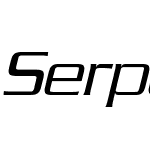 Serpentine Pro Light ObliqueVersion 2.000 Build 1000

Serpentine Pro Light Oblique 字体主要参数
| 字体家族: | Serpentine Pro |
| 字体风格: | |
| 字体版本: | Version 2.000 Build 1000 |
| 书体类型: | |
| 字符数: | 405 |
| 字形数: | 388 |
| 字重: | |
| 字宽: | |
| 文字: | |
| 区块: | |
| 来源类型: | |
| 文件格式: | |
| 授权方式: | |
| 字体嵌入许可: |

Serpentine Pro Light Oblique 名称参数
微软 - 英语(美国)
| 版权信息: | Copyright © 2013 Monotype Imaging Inc. All rights reserved. |
| 字体家族名称: | Serpentine Pro Light |
| 字体子家族名称: | Italic |
| 统一字体标识: | Monotype Imaging Inc.: Serpentine Pro Light Oblique: 2013 |
| 字体全名: | SerpentinePro-LightOblique |
| 版本: | Version 2.000 Build 1000 |
| PostScript名称: | SerpentinePro-LightOblique |
| 商标信息: | Serpentine is a trademark of Monotype Imaging Inc. and may be registered in certain jurisdictions. |
| 制造商信息: | Monotype Imaging Inc. |
| 设计师: | Jensen, Dick |
| 描述: | Dick Jensen (USA) designed Serpentine, is a contemporary-looking display font, for the Visual Graphics Corporation in 1972. With the rise of digital typesetting and desktop publishing, this typeface quickly became both popular and ubiquitous. This dynamic, wide, boxy design is identifiable via tiny triangular swellings at the stroke endings - what might be called semi-serifs. Serpentine is available in six different font styles: Light, Light Oblique, Medium, Medium Oblique, Bold, and Bold Oblique. Serpentine is a greenish rock that sometimes resembles a serpent's skin, and is often used as a decorative stone in architecture. Though this font doesn't seem at all snaky or sinuous, it does have an architectural, stone-like solidity. The subtle, almost non-existent curves and semi-serifs keep it from being too stern or cold. Although the underlying strokes of each weight are similar, the six members of the Serpentine font family all present their own individual personalities. Serpentine Light lends itself well to text for onscreen displays, for instance, while the numbers from typeface's heavier weights are seen around the world on soccer jerseys! Additionally, the oblique styles convey a streamlined sense of speed, furthermore lending Serpentine well to sport and athletic applications (especially the faster, high-speed varieties). Because of its 1970s pedigree, Serpentine has come to be known as a genuine retro face. This makes the typeface even more appropriate for display usage, in applications such as logo design, magazine headlines, and party flyers. If you like Serpentine, check out the following similar fonts: Copperplate Gothic (similar serifs) Eurostile (similar width) Princetown (another athletic font) Insignia (similar techno feeling) |
| 许可证描述: | This font software is the property of Monotype Imaging Inc., or one of its affiliated entities (“Monotype”) and its use by you is covered under the terms of a license agreement. You have obtained this font software either directly from Monotype or together with software distributed by one of the licensees of Monotype. This software is a valuable asset of Monotype. Unless you have entered into a specific license agreement granting you additional rights, your use of this software is limited by the terms of the actual license agreement you have entered into with Monotype. You may not copy or distribute this software.If you have any questions concerning your rights you should review the license agreement you received with the software. You can learn more about Monotype by clicking here: www.monotype.com |
| 首选家族名称: | Serpentine Pro |
| 首选子家族名称: | Light Oblique |
| WWS家族名称: | Serpentine Pro |
| WWS子家族名称: | Light Italic |
Serpentine Pro Light Oblique 度量参数
| 每em像素单位: | 1000 | 上标水平字体大小: | 700 |
| 水平最小值: | -232 | 上标垂直字体大小: | 650 |
| 垂直最小值: | -246 | 上标水平偏移 | 0 |
| 水平最大值: | 1158 | 上标垂直偏移 | 140 |
| 垂直最大值: | 877 | 下标水平字体大小: | 700 |
| Mac风格: | 2 | 下标垂直字体大小: | 650 |
| 最小可读像素大小: | 3 | 下标水平偏移: | 0 |
| 字体方向Hint: | 2 | 下标垂直偏移: | 477 |
| 升部: | 898 | 删除线大小: | 50 |
| 降部: | -355 | 删除线位置: | 250 |
| 行间距: | 200 | 字体选择标识: | 129 |
| 最大步进宽度: | 1111 | 字体排印升部: | 640 |
| 最小左跨距: | -232 | 字体排印降部: | -360 |
| 最小右跨距: | -321 | 字体排印行间距: | 200 |
| 水平最大宽度: | 1158 | Windows升部: | 898 |
| 非复合字形最大点: | 0 | Windows降部: | 355 |
| 非复合字形最大轮廓: | 0 | 斜角: | -1114112 |
| 字重类型: | 300 | 下划线位置: | -75 |
| 字宽类型: | 5 | 下划线厚度: | 50 |

- ·Serpentine Pro Medium Oblique
- ·Serpentine Pro Medium
- ·Serpentine Pro Medium
- ·Serpentine Pro Light Oblique
- ·Serpentine Pro Light
- ·Serpentine Pro Bold Oblique
- ·Serpentine Pro Light
- ·Serpentine Pro Bold
- ·Serpentine Pro Bold
- ·Serpentine Pro Medium Oblique
- ·Serpentine Pro Light Oblique
- ·Serpentine Pro Medium
- ·Serpentine Pro Light
- ·Serpentine Pro Bold Oblique
- ·Serpentine Pro Bold
- ·Serpentine Pro Medium Oblique
- ·Serpentine Pro Medium Oblique
- ·Serpentine Pro Medium
- ·Serpentine Pro Medium
- ·Serpentine Pro Light Oblique

推荐字体
 闽公网安备35010202000240号