


+ 关注
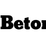 BetonW02-XBold RegularVersion 1.00

BetonW02-XBold Regular 字体主要参数
| 字体家族: | BetonW02-XBold |
| 字体风格: | |
| 字体版本: | Version 1.00 |
| 书体类型: | |
| 字符数: | 415 |
| 字形数: | 393 |
| 字重: | |
| 字宽: | |
| 文字: | |
| 区块: | |
| 来源类型: | |
| 文件格式: | |
| 授权方式: | |
| 字体嵌入许可: |

BetonW02-XBold Regular 名称参数
微软 - 英语(美国)
| 版权信息: | Copyright © 2006 Linotype GmbH, www.linotype.com. All rights reserved. This font software may not be reproduced, modified, disclosed or transferred without the express written approval of Linotype GmbH. |
| 字体家族名称: | BetonW02-XBold |
| 字体子家族名称: | Regular |
| 统一字体标识: | webfonts.fonts.com:Beton W02 X Bold:2012 |
| 字体全名: | Beton W02 X Bold |
| 版本: | Version 1.00 |
| PostScript名称: | BetonW02-XBold |
| 商标信息: | Beton is a trademark of Bauer Types, S.A. |
| 制造商信息: | Linotype GmbH |
| 设计师: | Heinrich Jost |
| 描述: | The Bauer Typefoundry first released the Beton family of types in 1936. Created by the German type designer Heinrich Jost, the present digital version of the Beton family consists of six slab serif typefaces. First developed during the early 1800s, by the 1930s slab serif faces had become one of many stock styles of type developed by foundries all over the world. Because of their distance from pen-drawn forms and their industrial appearance, they were seen as "modern" typefaces (their serifs kept them from being too modern). Faces like Beton were interesting contemporary competitors with more thoroughly modern experiments like Basic Commercial and Futura. The first slab serif typefaces, like Adrian Frutiger's revival Egyptienne F were outgrowths of didone style text faces (e.g., Walbaum). As newspapers and advertising grew in importance in the western world (especially in "Wild West" America), type founders and printers began to create bigger, bolder typefaces, which would set large headlines apart from text, and each other. Through display tactics, businesses and industry could begin to visually differentiate their products from one another. This craze eventually led to the development of monster sized wood type, among other things. By the 20th Century, the typographic establishment had begun to tame, categorize, and codify 19th Century type styles. It was in the wake of this environment that Jost developed Beton. Jost, one of Bauer's in-house designers, was also the creator of the prolific Bauer Bodoni, which is widely regarded as one of the best Bodoni revivals ever cast. The Beton family is a type "family" in a pre-1950s sense of the word. Although six styles of type are available, only four of them fit in logical progression with each other (Beton Light, Beton Demi Bold, Beton Bold, and Beton Extra Bold). The other two members of the family, Beton Bold Condensed and Beton Bold Compressed, are more like distant cousins. They function better as single headlines to text set in Beton Light or Beton Demi Bold, of as companions to totally separate typefaces. Beton Light and Beton Demi Bold are well suited for setting book text, and other running text applications that require sizes under 12 point. Beton Bold and Beton Bold Condensed may be used for shorter lengths of texts at 12 point or above, as well as for headlines. Beton Extra Bold and Beton Bold Compressed are best left to headlines and display purposes alone, although they could make a mean logo in the right hands. Beton is very similar to another 1930s German slab serif family, Memphis. |
| 供应商网址: | http://www.linotype.com |
| 设计师网址: | http://www.linotype.com/fontdesigners |
| 许可证描述: | NOTIFICATION OF LICENSE AGREEMENT You have obtained this font software either directly from Linotype GmbH or together with software distributed by one of Linotype's licensees. This font software is a valuable asset of Linotype GmbH. Unless you have entered into a specific license agreement granting you additional rights, your use of this font software is limited to your workstation for your own use. You may not copy or distribute this font software. If you have any questions regarding your license terms, please review the license agreement you received with the software. General license terms and usage rights can be viewed at www.linotype.com/license. Generelle Lizenzbedingungen und Nutzungsrechte finden Sie unter www.linotype.com/license. Pour plus d'informations concernant le contrat d'utilisation du logiciel de polices, veuillez consulter notre site web www.linotype.com/license. Linotype GmbH can be contacted at: Tel.: +49(0)6172 484-418 |
| 许可证网址: | http://www.linotype.com/license |
BetonW02-XBold Regular 度量参数
| 每em像素单位: | 1000 | 上标水平字体大小: | 650 |
| 水平最小值: | -177 | 上标垂直字体大小: | 600 |
| 垂直最小值: | -253 | 上标水平偏移 | 0 |
| 水平最大值: | 1080 | 上标垂直偏移 | 140 |
| 垂直最大值: | 906 | 下标水平字体大小: | 650 |
| Mac风格: | 1 | 下标垂直字体大小: | 600 |
| 最小可读像素大小: | 8 | 下标水平偏移: | 0 |
| 字体方向Hint: | 2 | 下标垂直偏移: | 351 |
| 升部: | 906 | 删除线大小: | 50 |
| 降部: | -300 | 删除线位置: | 250 |
| 行间距: | 0 | 字体选择标识: | 32 |
| 最大步进宽度: | 1122 | 字体排印升部: | 667 |
| 最小左跨距: | -177 | 字体排印降部: | -250 |
| 最小右跨距: | -176 | 字体排印行间距: | 289 |
| 水平最大宽度: | 1080 | Windows升部: | 906 |
| 非复合字形最大点: | 100 | Windows降部: | 300 |
| 非复合字形最大轮廓: | 7 | 斜角: | 0 |
| 字重类型: | 800 | 下划线位置: | -75 |
| 字宽类型: | 5 | 下划线厚度: | 50 |


推荐字体
 闽公网安备35010202000240号